Huh?
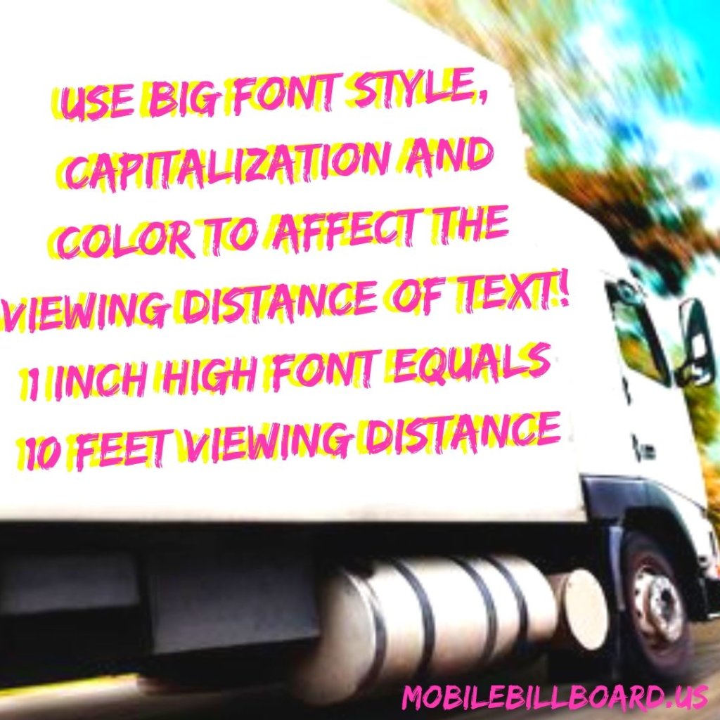
How far away a person can see your billboard ad from all depends on how tall the font is. Every inch higher that you make your font actually increases the viewing distance by ten feet. For example, if you want your billboard ad to be seen from 150 feet away, the font needs to be 15 inches tall.
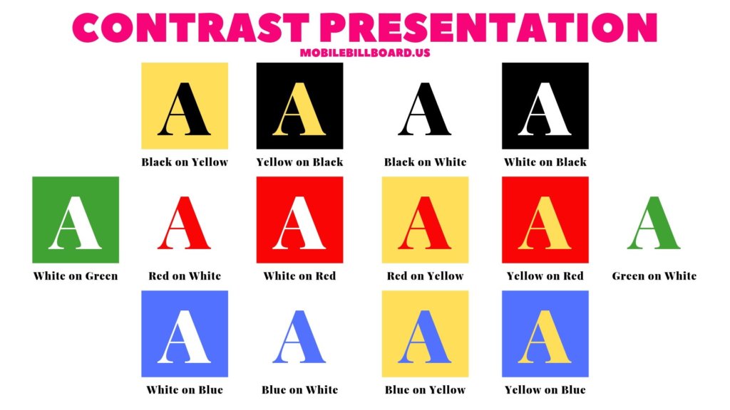
Another factor is the color of the font itself. Use colors that contrast with the background of your sign. For example, light colored background with dark colored text or dark colored background with light colored text. Below is an example of good color contrast.
Font text is another biggie. On large format mediums, like a billboard, Sans Serif fonts are much better for visibility. This simply means it doesn’t have fancy lines jutting off of the the letter. Simple lettering is best for far away visibility. Also, be aware of what type of lighting your sign will be seen in. If it will be out in the sun all day, you may want to avoid yellows, oranges or pastel colors and focus more on darker colors to increase visibility.
It’s important to remember to keep the font simple, capitalized and a nice, contrasting color with your background. Those three things alone will drastically improve the odds of your ad being seen from further away.
Click here for more ideas on How To Create A Fantastic Billboard Ad!