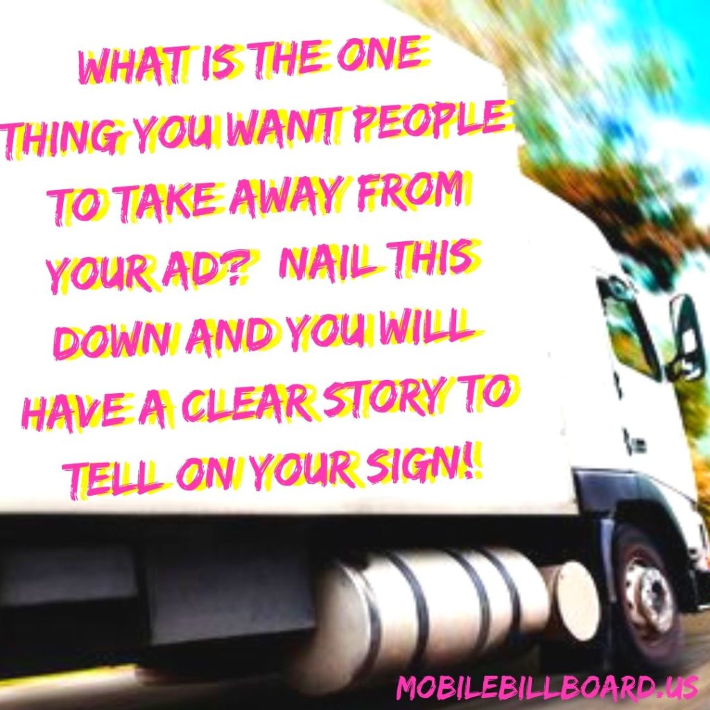
A design without a story is not memorable. In order to find what simple story you need to tell, first figure out what you want folks to take away from your ad. Do you want them to remember your brand when they are in the grocery store? Pull off at the next exit and buy your sweet corn? Do you want them to remember your website and check it out? You need to decide what single action you want the public to take when looking at your billboard sign.
Essentially, you want to take your main message and give it meaning. Have it solve a problem, fulfill a need or evoke an emotion and you have just found your story.
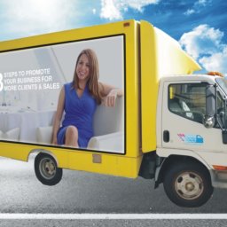
People may not remember facts but they sure can remember a story. Since mobile billboards are visual, you need to tell that story through images and/or text. A really memorable way to utilize text is to use a play on words or a short rhyme. Your billboard text should be 7 words or less to be high impact so why not evoke an emotion or fulfill a need by being creative with the words you use? Try to do things that create a chuckle and people are more likely to remember your company and the ad.
Because billboards are a visual medium, be strategic about what you show. Large, dynamic images help a consumer retain and recall your message better than words alone. However, your image should be interesting or eye-catching. A generic picture of a man holding your product isn’t that impressive but a controversial figure holding it or a shot of it in action creating a huge performance out of its appearance might just do the trick.
Remember that a picture is worth a thousand words so, depending on your campaign, you might just nix the text altogether in favor of a striking visual interpretation. You only have a few seconds to make an impact on passing drivers or pedestrians so use it wisely!
If you can generate smiles or elicit a reaction out of the people who see your ad, it is definitely one that will stick out in someone’s mind and be memorable!
Click here for more ideas on How To Create A Fantastic Billboard Ad!


